Category Archives: Precalculus

Snowflakes link

Check out a fun article on the shape of snowflakes! http://www.doublexscience.org/why-are-snowflakes-always-six-sided/ Entering finals week soon here.... White Bear Lake is not forgotten....

White Bear Lake water level and precipitation

Ok, my previous graph was ugly & slightly wrong so I'm going to put up an updated version. The units are better and so it should be a better visualization. Blue is for water falling from the sky and green is for lake level.

White Bear Lake Precipitation And Level

White Bear Lake Precipitation And Level

You can see much more easily here how lake level and annual precipitation tracked pretty closely for many years, but since about 2003 they have decoupled. The USGS has a report discussing the analysis that went into showing this scientifically, but you can see it here too!

Worksheet soon... digesting Thanksgiving leftovers still...

White Bear Lake

I've been in an EarthCalc intellectual downswing for a few weeks -- just could not think of anything interesting. It is weird how we have these mental blocks at times. Fortunately, a week ago Saturday I went to the first local Data Visualization Hackathon and had the pleasure of working with some folks to explore the declining level of White Bear Lake.

I've discussed White Bear Lake a bit before in talking about aquifers and rate of change. This weekend at the hackathon we looked more explicitly at the lake level itself, rather than water level in aquifers nearby. White Bear Lake is striking because it has dropped many feet since 2003. That change is visible from space!! Look in particular at the upper left corner of the lake:

The video above simply takes images from the Landsat satellites from 1984 through 2012, and was made by Nate Bird at the data viz hackathon using images from Google. Check out Google's Earth Engine which gave us the idea.

I also put together a very quick graph of lake level (in blue) and precipitation (in green), with clashing scales. It's not the best visualization, but it gives some illustration of the fact that the USGS says that White Bear Lake's average levels used to roughly lag yearly precipitation by a few years, but since the early 2000s has been somewhat decoupled from yearly precipitation.

I have a few more illustrations to put up in the next post, as well as the worksheet. First, though, I'll ask you to think about how we should model the lake! White Bear Lake is very irregular in shape. Should we idealize it and model the surface as a rectangle? a circle? The shape of the bottom is also quite complex. Should we model the lake as a prism -- like a swimming pool -- or as a bowl? What are the right answers to these questions, and how would we be able to know if we answered right or wrong?

Spreadsheets in the calculus classroom

Continue reading

Inverses and derivatives

It's that time of year where derivatives and inverses both start creeping into calculus classes, and all that notation at the upper right of a function name starts to get confusing! Continuing on a theme, I'm using pressure and altitude this week to do a quick conceptual worksheet on derivatives and inverses and derivatives of inverses. It's good to write out these relationships.

Not a ton of new science in this one, but perhaps useful if you're "following the story" of atmospheric pressure 🙂 I may add some similar worksheets with other settings for interpretation, just because they're fun!

Derivatives and Inverses: Altitude

Inverses and one to one functions

This is why I started the EarthCalc blog over the summer -- teaching is always like an oncoming train! With the other things I'm still working on, the weeks have been crazy!! Hopefully things will calm down as the semester progresses.

Well, my running in the mountains went pretty well. I'm a slow runner and the 11,000 foot altitude made me slower. This issue of getting enough oxygen is pretty important.

My previous worksheets on altitude and pressure talked about linear functions, power functions versus exponentials, and deriving the equations themselves, which was pretty sophisticated. This one has two pages (if printed duplex) asking basic questions about one-to-one functions and inverse functions. Interestingly, while atmospheric pressure decreases with altitude (monotonically if not constantly), temperature decreases and then increases due to the sun's warmth. Funky stuff happens at the very outer edges of the atmosphere, which we don't discuss. (But check out the leaky atmosphere worksheet if you're interested!)

I'll put up answers to this soon but wanted to get the worksheet out first. Here it is:

Inverses: Altitude

Revisiting the basics

This week's post is

  •  the first this semester (fall semester! I am teaching again! I wasn't quite sure if I would or not!)
  • curiously appropriate, since I am up in the mountains this weekend.

I'm at Brian Head Resort briefly, running down a mountain. This running race starts at around 10,000 feet of elevation and I'm not used to it. There's a short initial uphill run, and then a chairlift ride, and then a lot of downhill. I am thinking keenly about the amount of oxygen available to my brain and muscles.

(I'm hearing from my running-mates that you can't drive a rental car up Mauna Kea -- they all die because the air is thin enough that combustion is affected. You've got to get a good SUV. So throw this out to your students as a real-life application!)

Regular readers might remember the first set of worksheets I did on altitude. As I come back to class this September I'm reminded that there's always room for working through the most basic concepts in a clear and straightforward way. The worksheet I'll post in a day or two (next internet access!) looks at the concepts around inverse functions: the horizontal and vertical line tests. It uses some data taken from empirical measurements of temperature at different altitudes. Remember that we're hot down here, the temperature drops as we climb mountains and fly up in planes, but then if we're on the sunny side of the planet the temperature rises again in the upper atmosphere. There are some wiggles in the middle, too. (Check out the graph at this site.) Clearly, me telling you what temperature I am does not tell you uniquely what altitude I'm at! On the other hand, pressure is monotonically decreasing as altitude increases, and so me telling you an atmospheric pressure would allow you to estimate my altitude.

More later: time to adjust to 10,000 feet!

Momentary interlude

Check out this beautiful visualization of seasonal land ice and vegetation variation at NPR or at the original source:

Breathing earth

Breathing earth

Sea ice: a very baby model

I was traveling last week for a delightful conference on quantum cohomology, affine Schubert calculus, and the Peterson isomorphism. Crazy stuff. I had somehow expected to post during that -- but I learned something, which is that posting does not happen during intense conferences. I'll deal with that differently next time!

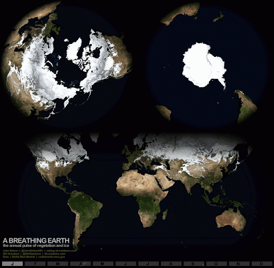
Many weeks ago in a discussion on LinkedIn someone suggested I write a post on sea ice, and I've been reading about sea ice ever since. It is complicated! Sea ice is the ice in the polar regions that floats on the sea, of course. It plays a huge role in climate because of its reflectivity, and we watch the growth and shrinkage of sea ice to monitor the state of the Arctic and Antarctic. But sea ice isn't just ice like an ice cube. Because the sea is salty, and salty water and fresh water freeze at different temperatures, there are some complicated phenomena that go on.

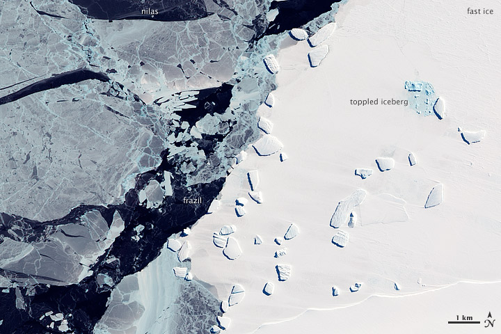
In the sea ice there are polynyas, areas of open water on top of the ice, and brine channels filled with bacteria and other little creatures. The ice itself ranges from new ice, starting with frazil ice through nilas ice through the stuff we think of when we think "ice." Even the names are exotic. Check out this picture below from the Advanced Land Imager (ALI) on NASA’s Earth Observing-1 (EO-1) satellite:

satellite photo of sea ice

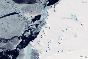
Zoom in to see labels for frazil and nilas.

One of the sites I'm using for a resource for the coming worksheet has a lot more cool pictures, so check it out.

With all this complexity in biology, climate, physics, and thermodynamics, there's a bit of work involved in simplifying the models for a calculus worksheet. The worksheet will get done by Thursday and will focus on Stefan's model (from 1890!) for the thickness of sea ice. It will use a bit of integration and some differential equations.

Assumptions need to be made to produce a model this simple: I'm going to assume no snow on top of my ice, no brine channels or microorganisms messing up my idealized slab, a linear temperature gradient inside the ice. Even with these assumptions we can make rough predictions about how sea ice thickness evolves.

But, so that I don't leave you without any classroom resource today, I leave you with a link to a nice precalculus activity on modeling ice thickness. I just discovered Plus Magazine, the source, today. It's a nice place to look for short articles on beautiful mathematics!

Rates of rates of change

Some instructors (like me!) like to foreshadow the ideas of concavity early in the semester. When I talk about rate of change, average and instantaneous, I like to throw out some discussion of the rate of change of the rate of change. This is a language puzzle for many students -- they may see that a function is increasing but need to think harder about whether it is increasingly increasing or decreasingly increasing. What does that all mean, anyway?! It's a great time to discuss precise mathematical language, communication skills, and the usefulness of equations. It is easy to be precise when symbolically indicating that a function is concave up, but our English language can obscure meaning here. Politicians certainly take advantage of this when discussing the decreased rate of growth in the budget or slowing the rate of budget cuts for social programs!

(Any examples a reader would like to publicize here? I know I've heard some great political lines like this but I cannot find a citation...)

This worksheet goes back to the air pressure activity introduced earlier. It is a fairly straightforward exercise in

  • computing average rates of change,
  • plotting secant lines, and
  • taking a first pass at the concept of concavity. 

Because it's straightforwardly computational rather than deeply conceptual, use this for a moment in class when you want students to work through the ideas but also want to give them a little mental break. It's a good time for getting a drink of water or chatting a bit about how things are going. Sometimes students need some computation and a stretch, as the ability to concentrate on mathematics for more than twenty minutes at a time takes development through repeated practice.

Rates Of Change: Mountains

I've been working on a post about interpretation of story problems and graphs, so that will probably make an appearance next week. It's also time to go toward derivative rules and derivative graphing. Good old-fashioned non-applied explanations of the derivative at a point and the derivative as a function are up to you, as I find students need a purely mathematical or formal explanation before applications. We'll revisit lynx and naproxen and hopefully add another story to the mix!