Tag Archives: aquifers

White Bear Lake: graphing

This worksheet is again about White Bear Lake and its shrinkage. This time, though, it's all about visualizing data. Data about surface elevation and surface area from the Minnesota DNR is again presented in the worksheet, and students are asked to graph it two ways. Which way is better for presenting the information?

I want to provoke an argument here! Getting students to argue in a constructive and respectful way is a great tool for pushing critical thinking and reasoning, as well as practicing language skills. Here, students need to think about the meaning of the information they're trying to present and then argue for which graphical representation is most effective. If I were teaching this in eighth grade I'd get students to write a news article about White Bear Lake, using mathematics and their own research!

White Bear Lake: Graphing surface area

White Bear Lake: rate of change

The worksheet up today is a short one-pager about rate of change. It's technically not using any calculus, but it asks students to compare rates of changes and draw conclusions about the shape of White Bear Lake.

Using some data from a 1998 Minnesota DNR report about surface area and elevation, the worksheet asks students to compute average rate of change of surface acreage for elevations 903 and 913 feet above sea level and then for elevations 925 and 926.5 feet above sea level. Change of acreage is really dramatically different for these elevation ranges: you can really see how shallow the shoreline of White Bear Lake is, and how much effect simply losing one foot of water surface elevation has. No wonder the current drop is so noticeable!

White Bear Lake: Rate of Change

I have some more ideas for White Bear Lake worksheets, so we'll see what happens. I'm thinking about

  • modeling surface area vs elevation using a spreadsheet
  • numerical integration to calculate volume of the lake
  • graphing: what's the best way to convey mathematical information?

White Bear Lake take one

White Bear Lake has been in the news a lot recently: Minnesota Public Radio is doing a big project about our dropping groundwater levels, for instance. And now that the holidays are over (Happy New Year all!) I've got the first pass worksheet for exploring White Bear Lake mathematically. No calculus yet, just an exploration of the area and volume of the lake. On average, White Bear Lake is pretty shallow. I think that's one reason the drop is so noticeable, especially on the western shore of the lake. In the worksheet students can find out just how shallow WBL is and also deal with big numbers.

As a teacher, I think this is an appropriate worksheet for a class that's dealing with big numbers (scientific notation would be great here!) and units.

  • Scientific notation!
  • Changing units.
  • Average depth from knowledge volume and area.

Precalc: Volume And Average Depth

If you've got suggestions for improving the worksheet, let me know! And check out my email subscription list on the side -- I will email you about the EarthCalculus book I'm putting together right now....

White Bear Lake water level and precipitation

Ok, my previous graph was ugly & slightly wrong so I'm going to put up an updated version. The units are better and so it should be a better visualization. Blue is for water falling from the sky and green is for lake level.

White Bear Lake Precipitation And Level

White Bear Lake Precipitation And Level

You can see much more easily here how lake level and annual precipitation tracked pretty closely for many years, but since about 2003 they have decoupled. The USGS has a report discussing the analysis that went into showing this scientifically, but you can see it here too!

Worksheet soon... digesting Thanksgiving leftovers still...

White Bear Lake

I've been in an EarthCalc intellectual downswing for a few weeks -- just could not think of anything interesting. It is weird how we have these mental blocks at times. Fortunately, a week ago Saturday I went to the first local Data Visualization Hackathon and had the pleasure of working with some folks to explore the declining level of White Bear Lake.

I've discussed White Bear Lake a bit before in talking about aquifers and rate of change. This weekend at the hackathon we looked more explicitly at the lake level itself, rather than water level in aquifers nearby. White Bear Lake is striking because it has dropped many feet since 2003. That change is visible from space!! Look in particular at the upper left corner of the lake:

The video above simply takes images from the Landsat satellites from 1984 through 2012, and was made by Nate Bird at the data viz hackathon using images from Google. Check out Google's Earth Engine which gave us the idea.

I also put together a very quick graph of lake level (in blue) and precipitation (in green), with clashing scales. It's not the best visualization, but it gives some illustration of the fact that the USGS says that White Bear Lake's average levels used to roughly lag yearly precipitation by a few years, but since the early 2000s has been somewhat decoupled from yearly precipitation.

I have a few more illustrations to put up in the next post, as well as the worksheet. First, though, I'll ask you to think about how we should model the lake! White Bear Lake is very irregular in shape. Should we idealize it and model the surface as a rectangle? a circle? The shape of the bottom is also quite complex. Should we model the lake as a prism -- like a swimming pool -- or as a bowl? What are the right answers to these questions, and how would we be able to know if we answered right or wrong?

Aquifers and Rate of Change

Since childhood I'd had a mental image of an aquifer as a big underground lake, but it turns out that's not so accurate. Aquifers are layers of permeable rock or ground-up rock (dirt, silt, etc.) below the earth's surface that contain groundwater. When we sink a well down to water, we're trying to extract water from an aquifer. Any time you hear about groundwater usage (as opposed to surface water usage) you should think "aquifers!"

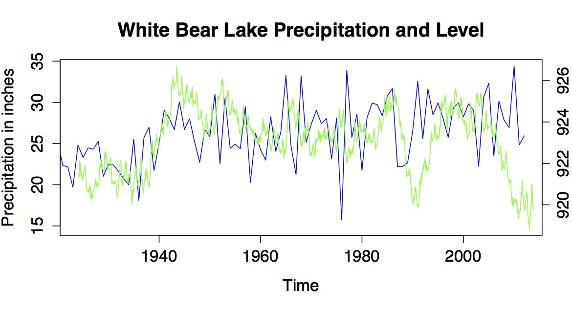
Why care about aquifers? Well, I like to drink water. When I visited Charleston, South Carolina and Savannah, Georgia this spring I learned that many wells in the region have been rendered useless because of saltwater intrusion -- if you pump out fresh water and you're near the coast, salty water comes in! Also, I would like it if my house did not collapse into a sinkhole. Apparently in 2010 about 130 sinkholes appeared in Florida, because of rapid removal of water from aquifers. That water in the spaces in the rock is pretty important. Last of all, many people enjoy lakefront property and recreation. The site just linked is for the White Bear Lake Restoration Association. Why does White Bear Lake in Minnesota need a restoration association? Because it's been shrinking dramatically, and now the docks are on dry land and lakefront property isn't on the lakefront any more. The US Geological Survey (USGS) and Minnesota DNR have concluded it's because of the draining of an aquifer that has contact with the lake.

Alright. We like drinking water, not falling into sinkholes, and waterskiing rather than trudging through muck. How, then, do scientists look at aquifer health? One way to do this is through keeping track of well levels across a region and coupling that data with geological information about aquifer locations. The graph of water level for a well is called a hydrograph, and this one is shared directly from the Minnesota DNR page with their permission:

fig1ppt

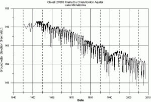
The USGS maintains a groundwater watch page from which you can find all sorts of data for your local wells, and many states maintain similar pages. I used the Minnesota Water Level Monitoring Page to find the raw data for the above well, and then used the R program to create graphs for this worksheet on rate of change.

You'll notice a huge seasonal variation in well depth. Groundwater is commonly used for industrial applications, which may be year-round, but also for agriculture and lawn care, which are seasonal. According to one source, the city of Woodbury in Minnesota pumps around 5 million gallons a day in winter and 20 million gallons a day in summer.

This worksheet looks at real, messy data. Students are asked to estimate a lot of numbers and discuss their estimates with group members and the instructor. It's a good time for discussion of estimates and how we deal with real, messy data -- shill for your local statistics class here! The worksheet covers:

  • graphical approximation of average rate of change,
  • graphical approximation of instantaneous rate of change,
  • creating a linear model using approximations of rate of change,
  • and analyzing the model.

The graphs take up a lot of room but the questions are pretty straightforward, so print it double sided and it won't take that long to do in class. Have students work in groups and ask different groups to report their results by writing them on the board: they will have different numbers and can discuss the validity of each approximation. The last question, in particular, is open for a lot of debate: what does it mean for a well to "run dry" if there is seasonal variation in water level?

 Rate Of Change: Aquifers worksheet

Oh, if you've forgotten, remember we're still under federal budget sequestration: the USGS is going to have to turn off a number of streamgages used to monitor stream health and warn of flood events because it can't afford to keep them going...